Monday, October 5, 2015

TIPS for TOPIC 2


Environment 
The first topic used a collection of tools (closeness, angle of view, dramatic light, mystery) to get you to take interesting pictures of things. Now time it is to move past things and create photographs that present an environment that your viewer can step into and spend some time. The first thing to do is to take a few steps further away from your subject and include the space that it inhabits. Then remove the specific subject and just keep the sense of space. 

Color & Feel
We do not see things directly. We see the light that is reflecting off of things that comes into our eyes. If you change the color of the light then the thing you were looking at will look different. The task now is to think about how the color of the ambient light in a space changes the ‘feel’ of that space. This is a good time to remember the sense of mystery that we were trying to create earlier. Think about what you have to do to create a mysterious space that will attract your viewer’s attention and keep them interested. Think about how the color of the ambient light changes through the day. Compare the light of dawn to the light at midday to the light at sunset (magic hour) and then consider the color of the various types of artificial light that we find during the night. [All of this is discussed in more technical terms in the handout on Working with Color.] All these different lighting environments can substantially alter the feel of the same space throughout the day.

Color & Saturation
One problem with color photos is that they tend to look too normal, aka regular, aka generic. It is desirable to alter the color away from normal to make a more interesting photo. Do not use over-saturation as the main tool to create striking photographs. Usually what you get is fake looking photos. (Unless you eye has already been perverted by the oversaturated televisions, computer monitors and even smartphones that we look at all the time.) [Most cameras pump up the saturation automatically, so it is better to desaturate to take things in the other, unexpected direction. Lower color saturation makes thing a bit more intangible, which is a desirable attribute.

Photo Clichés
I have to comment that there are still a number of photographs that come under the heading of Photo Clichés; dogs, babies, flowers, sunsets, City Hall and other buildings, lights, graffiti, etc. Please re-read the Photo Clichés document. Avoid people posing for a photo, or worse, hamming it up for the camera. That turns that photo into a snapshot. If people are aware they are being shot they become self-conscious and it usually doesn’t work. Simply asking people to close their eyes can make a big difference. The problem with snapshots is that the essential meaning is not actually contained within the photograph. Snapshots are used to trigger people’s memories, so the image is in their minds, not so much in the photo. This is not what we are looking for in this class.  
Typical Color Clichés include anything with overly intense color. If you are shooting just to grab the color and there is no deeper meaning behind that subject, the photo is not going far enough. It is stuck in the Physical Discipline only. Shooting graffiti, or architecture just for the shapes, is appropriating some else’s art. There are magazines dedicated to photos of graffiti and it is documentation. It is preferred that you make your own art directly from the raw material that the world provides for you. If you are using architectural elements such as graceful curves to enclose a space, or edges of buildings that cast sharp shadows, then you are on the right track. Avid shooting pictures that make jokes or puns based on the writing that is in the photo. These quickly become corny. Cute animals (are there any animals that are not inherently cute?) are a classic form of snapshot. 
Sunsets are a classic content of picture postcards and those are simply too generic. The feeling generated by the light of a setting sun can however be used to create an evocative setting for a subject, as long as the sunset is not the main subject (if even visible at all). Flowers are another classic photo cliché and should be avoided. They are just too easy. Photos of lights seem to be overused these days. The light cast by a fixture, however, can create an environment with ambience, as described above when talking about the sun, just this time it is interior rather than exterior.
The new Smartphone cliches are pictures of food and selfies. Don’t shoot ether of these for this class. I sent you a link to a whole page of examples of Smartphone Self-portraits. You can draw inspiration from those.

Structure
Remember the structure elements that we learned in the first topic, such as not shooting singular elements that are easily identifiable and not centering your subject in the center of the frame. This locks up your viewer’s viewpoint. You should remember that when you shoot on the street you have to have something, or better, several somethings that you want to draw your viewers attention to. I see too many shots where I do not really know where the photographer wants me to look, or what order the photographer wants me to consider several subjects. The shot has to set up a hierarchy of importance between the elements in the frame, and that help define their relationships. And relationships is the beginning of the road to Passion. If I cannot understand that from the structure of the photograph then I will not be able to communicate with photographer and feel their passion.

Note: You are allowed to continue to wrk in B&W if you wish. If you do more work in B&W,  those photos need to be toned, even if just slightly. Dead flat B&W is not enough.

Good luck and keep shooting - - -


Monday, September 21, 2015

Teaching Points - Topic 1 B&W + Toning = Mystery


There is a particular collection of photographs in this group that seem to draw from a Surrealist perspective. I don’t think it is intentional but it is very interesting when a group of people who are just starting to know each other all come up with a similar vision. 

Surrealism was an artistic movement that started in the 1920s as a manifesto written by author André Breton. Painting did not come into the movement until later. The basic idea was to allow the unconscious mind to reveal itself in artistic expression. It was felt that conscious thought repressed the unconscious mind and therefore restricted the imagination. The pioneering psychiatrist Sigmund Freud was also an influence on the movement. 

Let me point out which photos work this way and maybe you can take this energy and develop it further. Although, the contradiction is that if you actually TRY to make it happen, it become s a product of the conscious mind once again. The question then is, how did people like Salvador Dali manage to capture their unconscious mind to then be able to paint in a photorealistic manner, that requires great skill. [There were experiments with ‘automatic writing’ that allowed the artist to make images directly from the unconscious mind.] This takes us back to my description of Intuitive vs Disciplined Shooting, and the importance of utilizing both of these strategies in your work.

The first photograph that works this way is the clouds above the stairs by Minami Okajima.


Perhaps it is her great use of contrast that makes this seems sort of unreal. Clouds also show up in any number of surrealist paintings. But all in all it looks almost like a dream. She has another shot that seems almost normal at first but here is something strange about it. 


It is this quiet space that has a lot of ‘feel’. The chairs in the room mimic the chairs in the painting that almost looks like a mirror. It is just ‘off’ enough to take my mind into that dreamworld. I don’t know if I can explain it, but if I could then maybe we wouldn’t need photography. 

[quick definition: The photograph is what is on the paper (or screen). The image is what is formed in your mind.]

Another shot that falls into this category is this by Coleen Kennedy  The carousel is another one of these unreal places where children are allowed to let their imagination take them on a horse ride. It is also a locale for some creepy movies that also derive some of their essence from the surrealists. The inclusion of the other ride in the right side middle ground of the photo and the far away horizon all contribute to the success of this photo.


Morgana Sugzdinis presents a similar locale with a different attitude. This one seems more positive. This is a great example of talking a photo of something interesting but giving us a view that we would never have seen even if we were there. It presents her own unique view of the world. And this one is perfectly toned, something that is missing from most photographs posted and something that was part of the topic. The tonality throws it back in time, adding to the atmosphere of the shot.


And the last of the surrealist shots has a woman floating in a dream world, also by Morgana Sugzdinis. This is one of those exceptions to the ‘do not center your content’ rule because she has extended the foreground so that you eye is not glued to the middle. The balance of irregularly shaped trees on either side of the background also keep the eyes moving.


The next compelling photo by Ian Aubry is seemingly simple, but it has that ‘feel’, that emptiness that transcends what is in the photograph. I have seen hundreds of train pictures but this one captures that quietness better than most.


And I have to come back to Minami Okajima for her shot of a food counter. It is deceptively simple and perhaps it is this reduction of the space that makes it work. Here you see how it is possible to take something or someplace that you see all the time and make a viewer stop and contemplate it. This instills awareness in your viewers. By the end of this class you will look at everything differently than you did a few weeks ago.


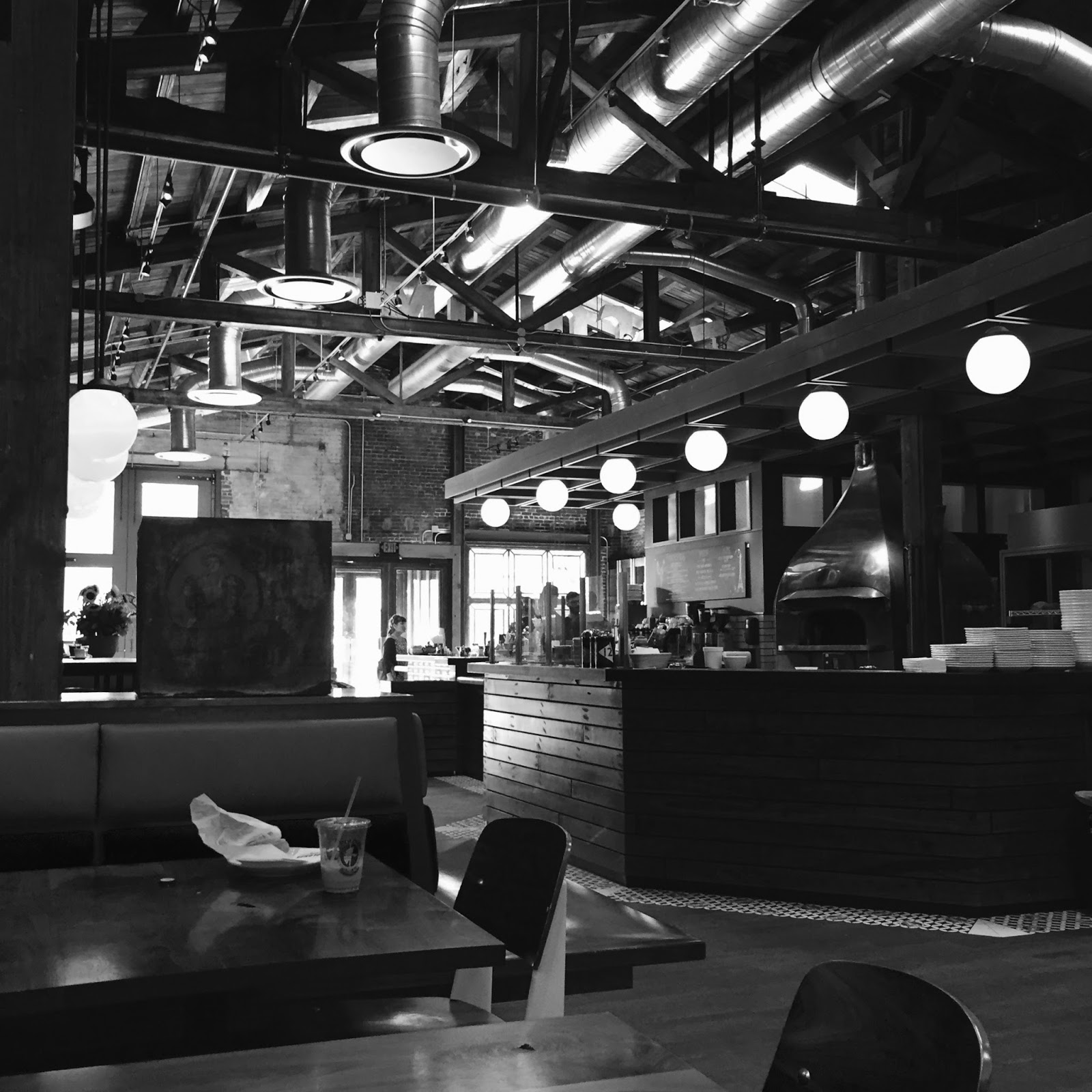
This shot gives me a good segue into the next photo by Ian Aubry that has a restaurant theme.  


This is a beautiful intersection of shapes and lights and darks that all create a mood. The contrast in this photo adds drama. The payoff is the crumpled piece of paper and half-filled cup on the table, leaving evidence of the last people who were in that spot. If you look hard enough you will find a person or three at the far back of the space, but it is the emptiness that prevails. [p.s. I was just taken here for a espresso macchiato yesterday!]

And here is another beautiful interior space shot by Dymond Scarborough with extraordinary light. It is not how anything looks as much as about how the space feels. This is a place where you can spend some time (unless you are scared, which is another possibility).


Dymond pulls off another interesting photo at night with this wide landscape. She controls her viewer’s eye by placing interesting content at both extreme corners, and we keep bouncing back and forth. The light on the trees and that beam in the center top make a triangle of interest. This is a well structured photo.


Since we in the nighttime now, we can look at two shots that are very atmospheric. The first by Dymond Scarboro very cleverly counterbalances the moon with a streetlight. The light on the trees enhances their shapes and the curved wire adds another unique brushstroke to the canvas.


The next shot by Kevin Pizzini is even more obscure but still paints a landscape (or perhaps even an encounter?) in our mind’s eye. Another example of the photo creating an even larger image in our mind.


Following this collection of diffuse photos we can look at this leaf by Coleen Kennedy where the itself is soft and delicate, just like the subject. This is a good example of Form supporting Content. The beads of rain talk about a very specific time. This reminds us of the Romanticism that was popular in photography 100 years ago. All it needs is some subtle warm tone or sepia tone and it would be perfect.


An interesting example of obfuscation is seen in this shot by Keriann Blumenstock. The curtain fractures the landscape behind. This reminds me of some of the early cubist work, some of which was inspired by the ‘camera vision’ that was new at that time.


The final commentary is on some of the self-portraits. The first by Morgana Sugzdinis is seen from above. This is a powerful tool for altering expected appearances. And someone in the comments questioned why she seems to be fully clothed in the water. Something for us to ponder...  


And the final portrait is this face by Lauren Myers. It has all the power of a Nat Geo cover, with a stare that is intriguing and beguiling. See if you can get your self-portraits up to this level of mystery and passion. Ah yes, passion, the next step when we add color to the mix.  


Thank for all your work on this topic. You should all go back an add some toning. You will have to hand in the best of these for your Final Reviews.

[hint: the level of your grade is related to the number of prints that make it to the Teaching Points blog.]

notes: 
• Loose the shots of singular objects, or anything centered. Your photos should have multiple points of interest to keep your viewer’s eye moving through the picture space. 

Multiplicity
Some people talk about honing their photos down to one specific point of interest. I would suggest that this leaves your viewer with nowhere to go. I recommend setting up shots so there are several points of interest so you can guide you viewer’s eye through the picture space, and consequently, shift their mind from one subject to another, setting up relationships; between lines and curves, darks and lights, or between people and the emotions they evoke, or between specific ideas or ways of evaluating things. [physical, emotional, conceptual]

• Loose the animal pix. Some of them are pretty cool pix, but in the end they are still only cool pictures of animals, and that identifiability ruins it.  

Generic vs. Specific
Almost everyone has a dog or cat, but this is one subject you will never see in an art gallery. It is too personal and too cute. These are the kinds of photos people share with their friends on-line but they are too generic and that is why these become snapshots. This is not a photography class or a class in how to make better shots to share on-line. It is an Art class and we are interested in photos that one would see in a good gallery. [p.s. I I have a house full of cats and I take pictures of them all the time. But I would never display one as artwork, and I am not particularly interested in seeing shots of a cat belonging to someone I do not know.]

• There should be a payoff of some meaningful content that you want to share, something that might also be of interest to someone else. This could even be getting your viewer to contemplate something they have never seen before, or something they see all the time but have never bothered to actually stop to look at.

Personal vs. Public
Some of you speak of memories associated with the photos. Some of these memories are too specific and too personal. When they are so personal that no one else can access that information, then the photos become snapshots, and there is no communication. What has to happen is a blend of personal memory and public accessibility in an attempt to share life experience.

• You have to follow the same rules for self-portraits as you do for any other art photo; you should not be a singular object in a nondescript space, centered in the frame, easily identifiable. That defines a head shot and they are not interesting, just informative. Pictures of your feet are NOT self-portraits. 

Photo Clichés (additional)
Avoid vintage cars or old trucks decaying in the woods. Refrain from shooting tabletop setups with toys or sic-fi figures.

• Don’t forget all of these tips when we move to the next topic. Everything builds on top of the previous.

Internal vs. External
Get out of your apartments and go photo hunting. First of all, indoor lighting is terrible and flat. Second of all you have to make a greater effort than that.
If you are driving in a car and see something you want to shoot, stop and get out of the car! Take the time to fully investigate your subject.


“Making art is not the ability to draw (or operate a camera) – it is about being able to see what other’s cannot.”

A Path to Success

I want to applaud everyone who, in addition to what they did well, also noted what they felt they failed at, and then offered solutions on how to fix this. This is the most helpful commentary and true self-evaluation. 

Thank you for all of the good work - - -


Saturday, September 19, 2015

TOPIC 2 - Color = Passion


For now we will concentrate on the straighter end of color, and then will get to all the crazier stuff for the next Topic. I want to make sure you know how to control color by what you shoot, when you shoot, and how you should before we move to altering color with post-processing.

Remember that the Topic is merely the technical side of it. The Content, the subject of what you're shooting, still is completely up to you. These photographs have to be about what YOU are interested in before anybody else can be interested in them. If you just shoot for an assignment then you are shooting somebody else's photographs.

There are three lectures that you should read through:

• The first is mostly text and is about Color Theory:
[some of it gets into Photoshop adjustments and information about printing that are not
particularly relevant for this class so you can skip over those paragraphs.]


The next is about how to work with color to produce various emotional responses:


There are several phases that I would like you to focus on:
Nonochrome = no color, which is where we started with the B&W shots,
this what happens if you shoot color pictures of things that have no color.
Monochrome =  1 color; try shooting things with predominately 1 color.
Harmonious Color = expands to include several colors that are all very close
Complimentary Color = opposite colors; 
e.g <red - cyan>, <green - magenta>, <blue -yellow>

The third is about shooting Color at Night, and it is a slide show web page


More thoughts on Shooting in Color:

Color photography is a lot harder than Black & White. This is because when the Black & White process removes all of the color, it injects a sense of a mystery. Color photos however quite often look too real. Mystery is a most important element in making compelling images. If your viewer can identify objects in the photograph quickly, then they will stop looking. This makes an unsuccessful print. You have to make photographs that pose questions rather revealing answers. [if your photos just provide information and do not engage the viewer in a dialog, then that is photojournalist. This is not better or worse than art-photo, but it is different. (This doesn't mean you can't use a photojournalist style, but...) (note: there is no black or white in these classifications, just shades of gray.)
So we are looking for photographs reveal the eye, the heart and the mind of the photographer. When you do this you imbue your photographs with a sense of Passion. We can see you in the photos. We do not want photographs of things, we want  photos of you looking at things. This is the difference between passive and active photography. Passive photographs, pictures of things, fall to the documentary side. These are objective, and art tends to be about subjectivity. As Cartier-Bresson said, "Ideas are not interesting. It is opinions on facts..." In the long run what is interesting is learning about how someone (the photo artist) sees the world, and how much of their personality they share with you, the viewer. It is about their personal vision (that includes the visual, the emotional and the conceptual aspects of their being) and how that resonates with your own personal vision.  Who wants to look at work made by someone who doesn't share your point of view? (Although sometimes contrariness can be stimulating!) (“You're not making art until you piss someone off!”)

Please remember to not forget all the visual tools you picked up during the first project in B&W. Closeness, Angle of View and Dramatic Lighting are still key elements. In fact, they are even more important now. Having multiple points of interest in the frame is also very important.

Please re-read the Photo Clichés handout. Classic color clichés are sunsets. Photographs that are taken only for color effect remain in the physical domain only. We are looking for photos with emotional impact. Another Smartphone cliché is shooting food.

Please look at work by the following Photo Artists on the RESEARCH pages of the berk-edu.com site: Some of this may be beyond the reach of a first level class, but you should be aware of the many ways that photo-artists work.


PLACES : COLOR
Jan StallerArthur Ollman : color at night
Richard Misrach : color landscape
Joel Meyerowitz : cape light 
Stephen Shore : urban landscapes
William Eggleston : suburbia in color
John Divola (color)John Divola (bw): creative vandalism
Patrick Wertan : numbered cityscapes

Naoya Hatakeyama : night landscape
Joel SternfeldAlan Cohen : landscape in memorium

John Pfahl : altered landscape, beautiful pollution; windows
Ken JosephsonAkira Komoto : conceptual vision

PEOPLE : COLOR
Nan Golden : the ballad of sexual dependency
Joyce Tennyson : studio portraits 
Pierre & Gilles : beautiful people
Loretta Lux : children

Gregory Crewdson : staged dramas
Lucas Samaris : altered polaroids


Saturday, September 12, 2015

CRITIQUE PREPARATION


Critiques are where everyone shows their final selection of photographs for the given topic and everyone else comments on them. The idea is for everyone to work together to make all the photographs better. There is no one point of view that is correct in the Art world. It takes input from everyone in the class for us to learn how our photographs are being received. It is a matter of communication and peer review. If the feedback you are receiving is close to what you intended your photographs to say, then you are doing well. If you are getting a very different response, or people are missing your point, then you need further refinement in aesthetics and technique. 
You should be constantly posting photographs and looking at what everyone else is posting. This class is based in experiential learning. You cannot learn how to do this just by reading about it. You have to DO it, receive feedback, and then refine your work.

OVERVIEW
Here is an overview of what has to be accomplished during the next week, and during all critique weeks in the semester. It may look like a lot when all viewed at once, but take it one day and one task at a time and it is easy.

Monday (note: Critique 1 is due on Tuesday due to Holiday) 
Every fourth Monday is the due date of the next Critique. The posting should be done by 5 PM.
Before this date you should go through everything you have posted on-line (there should be more that the minimum number of prints already on-line) and edit down to the actual number of prints due (or a little bit over if desired). 
  • the full number of prints required for the critique should now be uploaded
  • reorganize the photos by content
• see the minimum number of prints on the Semester Schedule
you should have this Schedule printed and posted on your wall 
  • add numbers above each of your prints so people can easily vote for their favorite

Tuesday (note: Commentary 1 is due on Wednesday due to Holiday)
You have a day to look at what everyone has posted for their critique and formulate ideas about what they have done. You then have to make commentary on the photos of your classmates. The commenting period ends at 5 PM on Tuesday.  
  • look at other people’s photos and comment on them
    • base the commentary on 3 criteria: content, form, impact [3 Disciplines]
(sharing personal experience: resonance)
  • cast a vote for at least 10 people in the class. Indicate which shot you think is their best
  • if you see someone already has 5 comments, go on to someone else
  • this will assure that everyone receives the same number of comments
note: no one will want to comment on your photos if you do not comment on theirs. 
This is another variation of the Golden Rule.


Thursday
You have two days to review all the comments you have received and write a Self-Evaluation that presents a synthesis of these reviews. The self-evaluations are due by 5 PM.
  • review all the comments you have received
  • write a synopsis of that commentary, again based on 3 criteria: form, content, impact 
  • there is a handout explaining how to write a self-evaluation
  • determine which of your prints is the best (according to peer voting)
  • The votes cast by your classmates in their comments on the class blog 
will help you determine which photo is the ‘best of the week’
  • This photo is designated your POW (Picture of the Week)
  • include the POW at the top the Self-Evaluation document
  • please write the Self-Evaluation in MS Word
    • use 12 point type
    • use 1.5 line spacing (under Paragraph Formatting)
  • start the document with a header as follows:
Your Name
Smartphone Photo 2831-section #, Crit 1 - B&W: Mystery
  • name the file in a similar manner:
your name_self evaluation - crit 1 - section#.docx
  • upload the finished Self-Evaluation document to OWLbox
  • there is a separate folder for each critique

Fridays are the introduction days of new topics including aesthetics, techniques, ways of shooting, ways of processing (apps), etc. You should study and absorb this information quickly and, in a day or two, start shooting, processing and posting your photos to the class blog. You should shoot and post every day. That is part of the routine of this class.  
You can only really learn about photography by thinking, shooting, and posting on an ongoing manner [think, make, share]. This is an Art Studio course and it utilizes ‘experiential learning’ that is quite different from the ‘book learning’ as in most academic classes. Because of this, it is not possible to cram for a studio class. You cannot wait unit the day before the Critique is due to shoot everything. If you try this you will never learn how to shoot properly let alone how to think about what you are shooting or feel what your photos are expressing. Do not cheat yourself out of the education you are paying for. 

note: All students must participate and complete all phases of each Critique cycle. Failure to complete any segment results in failure of the entire critique. 

note: All Topics are defined and available on the professor’s web site at all times. If you want a head-start you are welcome to read those.